
.svg)
.png)
.png)
.png)
Logotype
Our logo comes in 4 color variations: For most of our communications, the full-color logo is preferred.
All variations should follow the background color it is displayed on, this goes for online use, print and materials.
.svg)
Spacing
The safe distance to put our logo is always the top left corner.
There should always be enough space around the logo for it to be displayed properly. At least 1/4” for small print & web. Large scale print will vary by size. The logo should always be the first item seen on any ArkBM branded materials, documents and online presence.
Minimum Sizes
To preserve the integrity of our logos, always maintain a minimum clear space. This clear space insulates our logo from distracting visual elements, such as other logos, copy, and illustrations.
Our logo is designed to scale to small sizes on print and screen.
.svg)
%201.png)
%202.png)
%203.png)
.png)

%206.png)
%207.png)
%208.png)
%209%20(1).svg)
Please Don't...

Please Don't...
.png)
Outdated Version
Please be mindful, if you are currently using either of these logos... please update to our 3.0 version.
.svg)
K's top was too long and forward and the bottom was not flush, curve was too funky
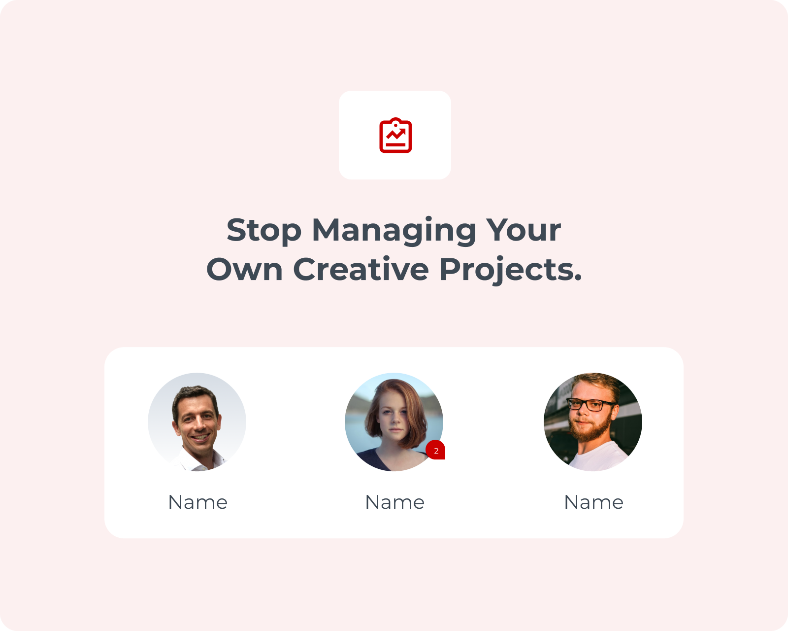
Breakdown
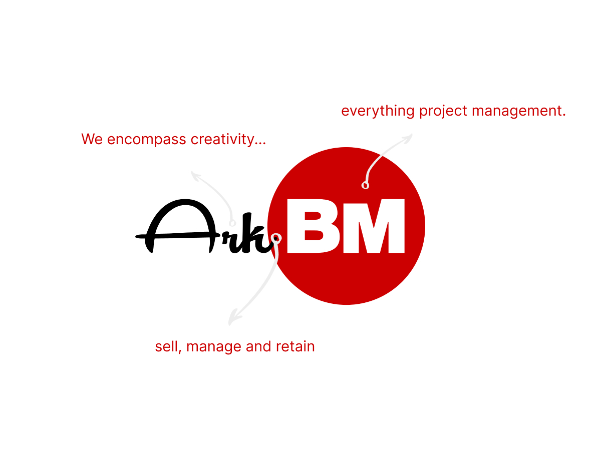
We encompass creativity...sell, manage and retain everything project management.
Icon
Our red dot icon signifies the target and allowing a single point of a project's objective.
The icon can should only be placed at the bottom right hand corner.


Brand Colors
As part of ArkBM's branding specific personas will have assigned colors, and various colors also are used as visual cues for users
Dominant, actionable & attention grabbing "Power" is used.
Highlight, accent & complement or enhance other colors.
Secondary color to provide contrast & deliver a clean, simple background or text.
Works best as a secondary color to amp up a bright accent colors.
May not be dominant but, can be used as an accent color and graphics.
Create a bold pop and it's frequently paired with "Pepper".
Use with Salt colored text on top
Use with Salt colored text on top
Use with Pepper colored text on top
Color Usage
Based on the ArkBM app, each user group has a specified color theme. The selected color will be the primary display color while all other colors will be used as accents.
Montserrat
1. Semi-Bold
2. Classic
3. Regular
Lorem ipsum dolor sit amet, consectetur adipiscing elit. Suspendisse varius enim in eros elementum tristique.
Usage
Headers should be Montserrat Semi-Bold.
Sub-Header should be Classic.
Paragraphs should be Regular.

Corners
To help create a modern yet sophisticated look NO shapes should contain sharp corners. All component corners should be rounded.
To help create a modern yet sophisticated look NO shapes should contain sharp corners. All component corners should be rounded.
.svg)
Shadow
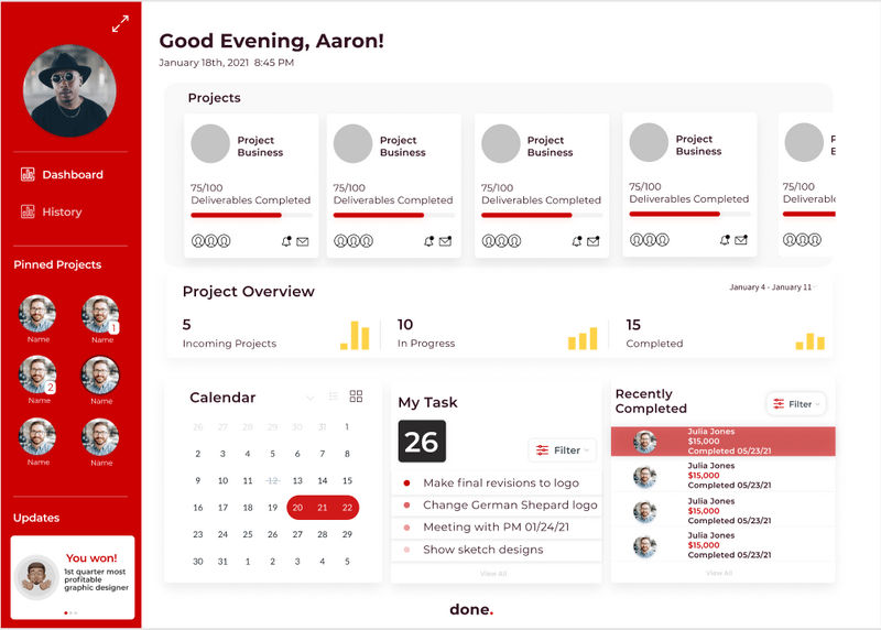
Shadows are an important part of the design system because they help create specified sections that user can easily identify against the whitespace of the page.
All components that lay on top of white space should use the specified drop shadow below. Drop Shadow - Blur 20%, Opacity 7%*X & Y coordinates can be adjusted to best fit the layout of page but most common usage is X-0 Y-10
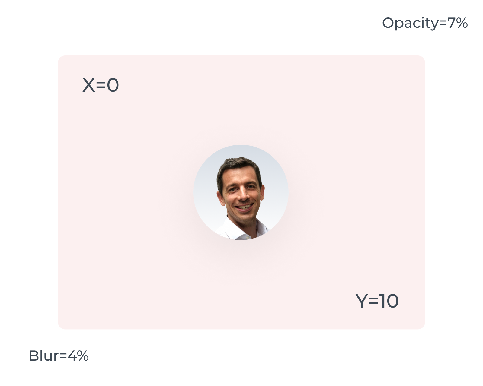
Where there are areas of colored background the only elements that need shadow are profile images for users, text and icons can sit directly on the page. Background Blur - 4%
.svg)
Blur
Utilize screen blurs when there is a pop-up or overlay covering any part of the main screen. This will help focus users' gaze and combat information overload on a single page
Make sure to blur the entirety of the screen except for navigation components that might still be helpful to users Overlay Background Blur - 4%
.png)
Spacing
Spacing on pages may vary slightly due to the number of components users need.
Below are the minimum and maximum spaces allowed. Always arrange components with spaces that are multiples of 6 (ex: 6 px, 12px, 24 px) Minimum - 6px Maximum - 96 px
Alignment
Left align all text unless it is being used to label an icon, in this case, center with the icon.
.png)
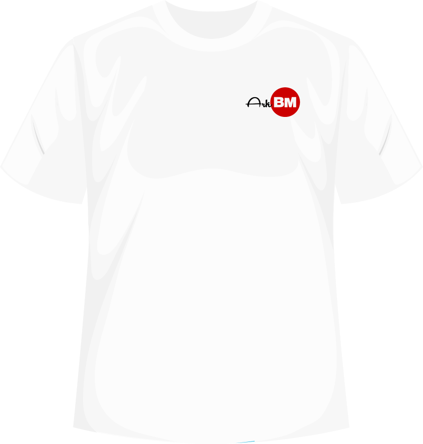
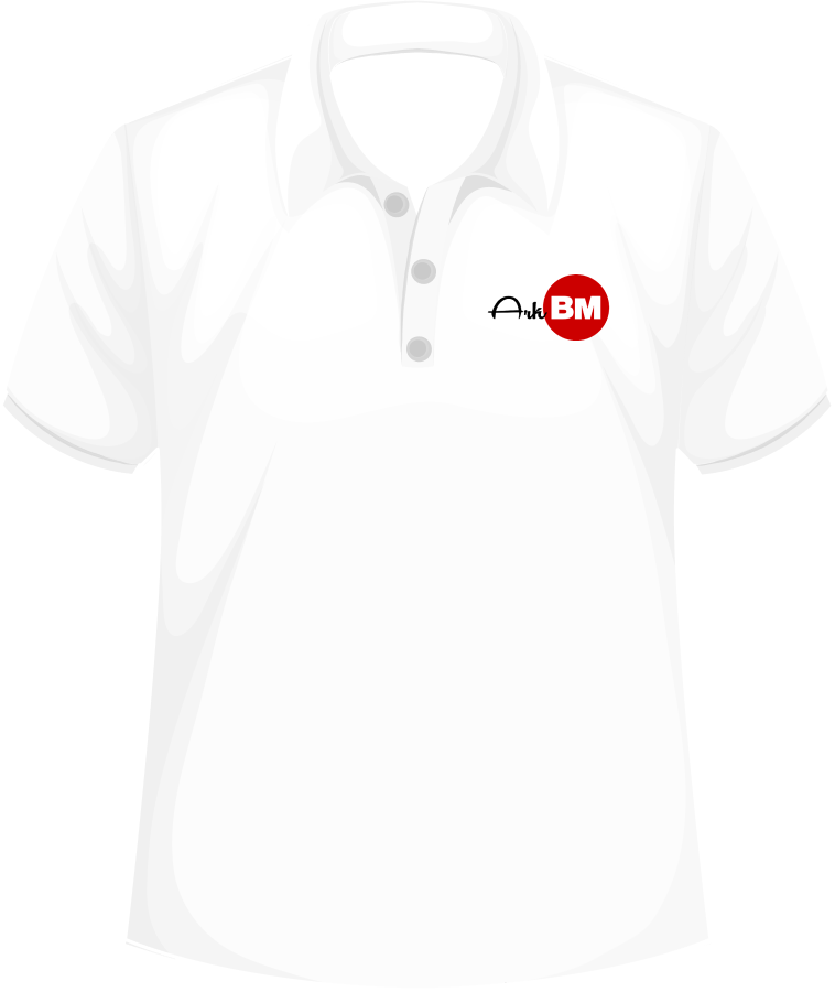
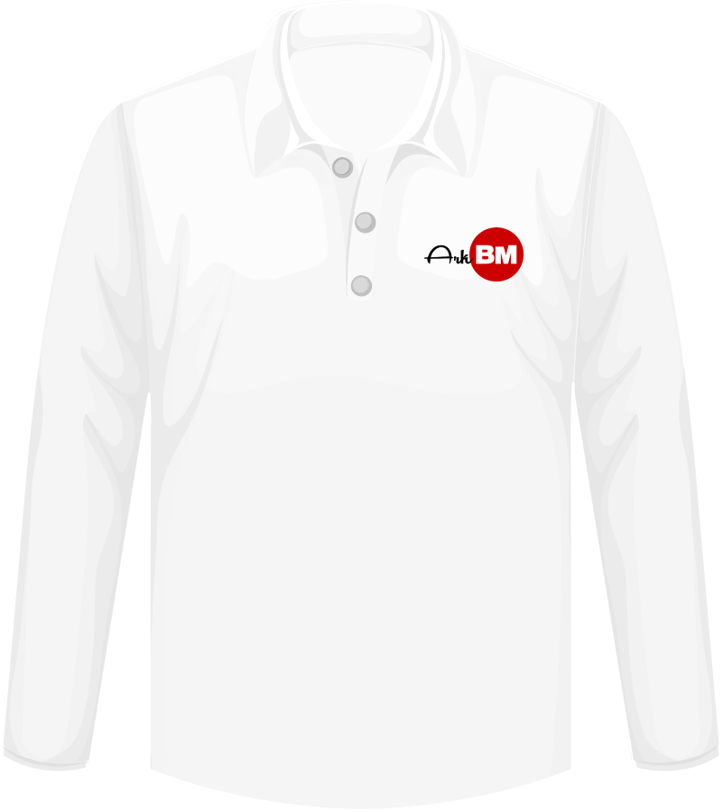
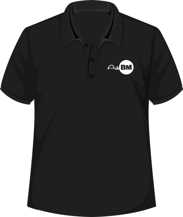
Polo Shirts
Collar shirts can be short or long, dress shirts or polo style.
All shirts must be crew neck style and logo left breast. Logo size should be 3 inches long.
.png)
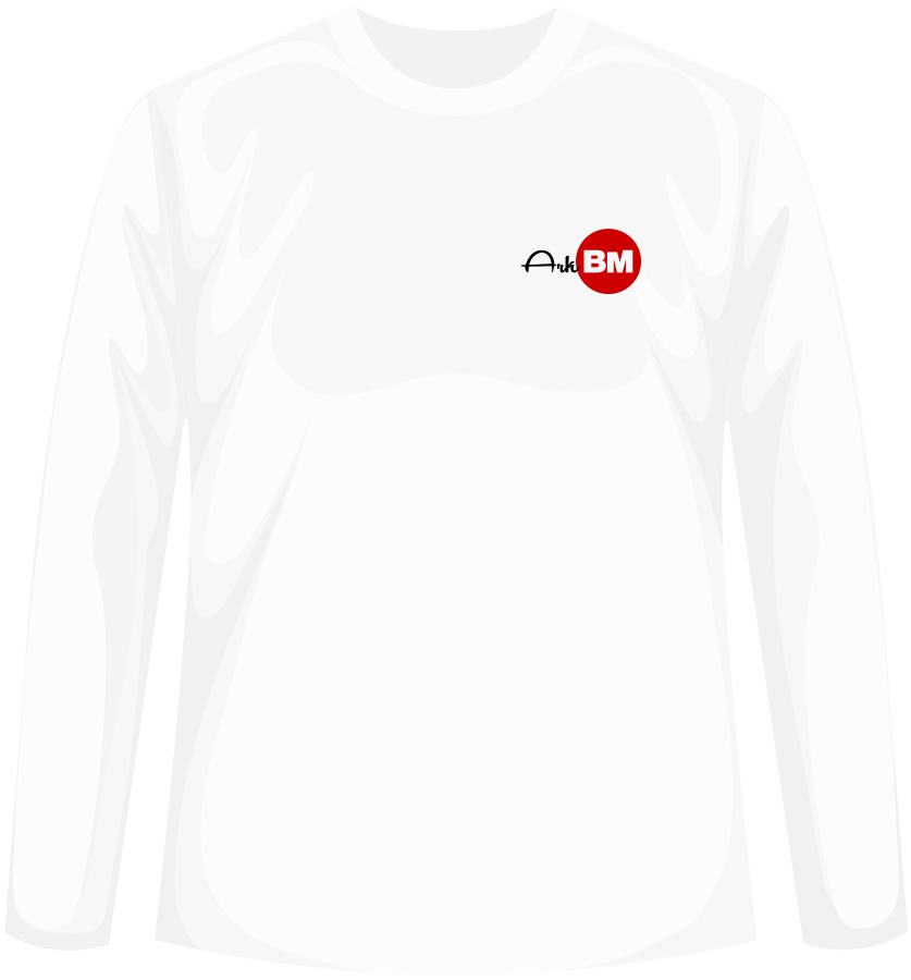
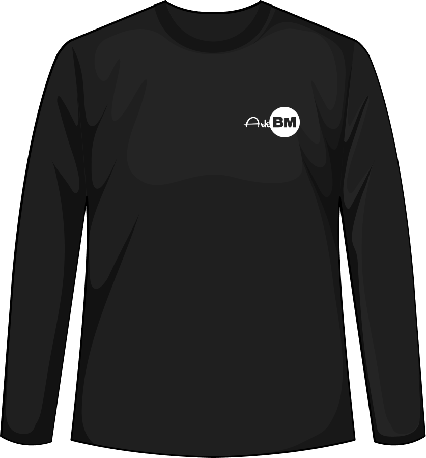
T-shirts
All shirts must be crew neck style and logo left breast. T-shirts must be pocketless. Logo size should be 3 inches long.

Icons
Icons should always be placed to the right of any wording, paragraphs, or text.
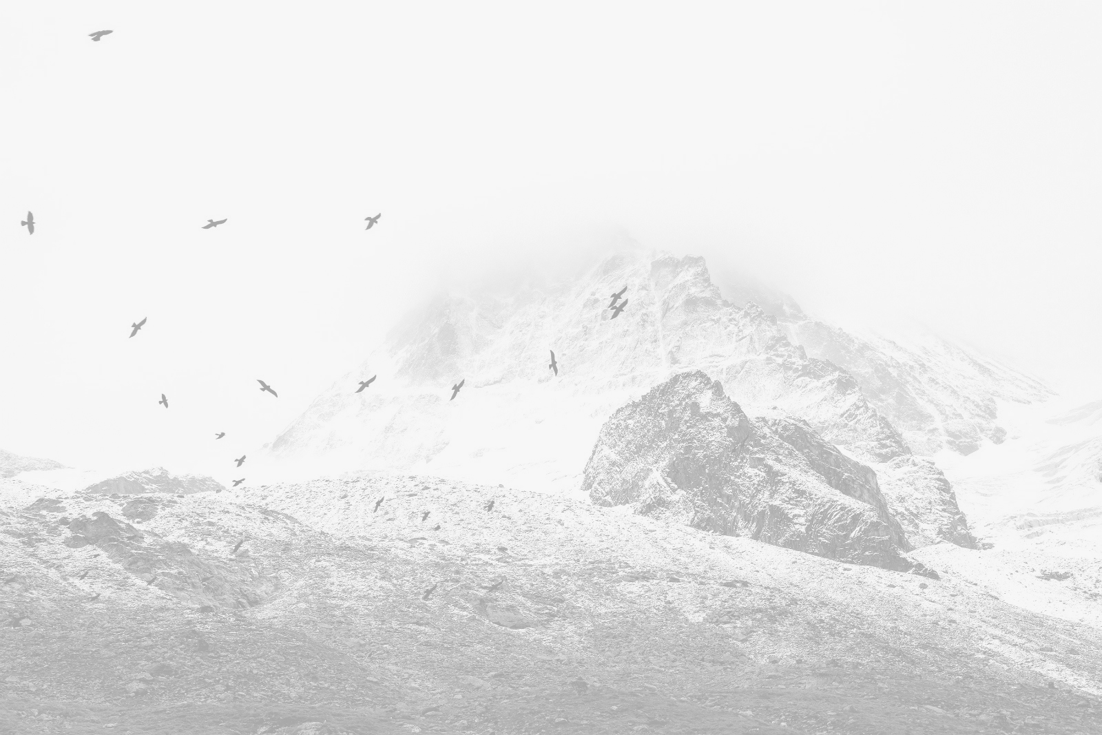
Images
ArkBM uses the images of the local area that they are referring to.
.svg)
Symbol
ArkBM’s red circle indicates the complete of the page, project or sentence.

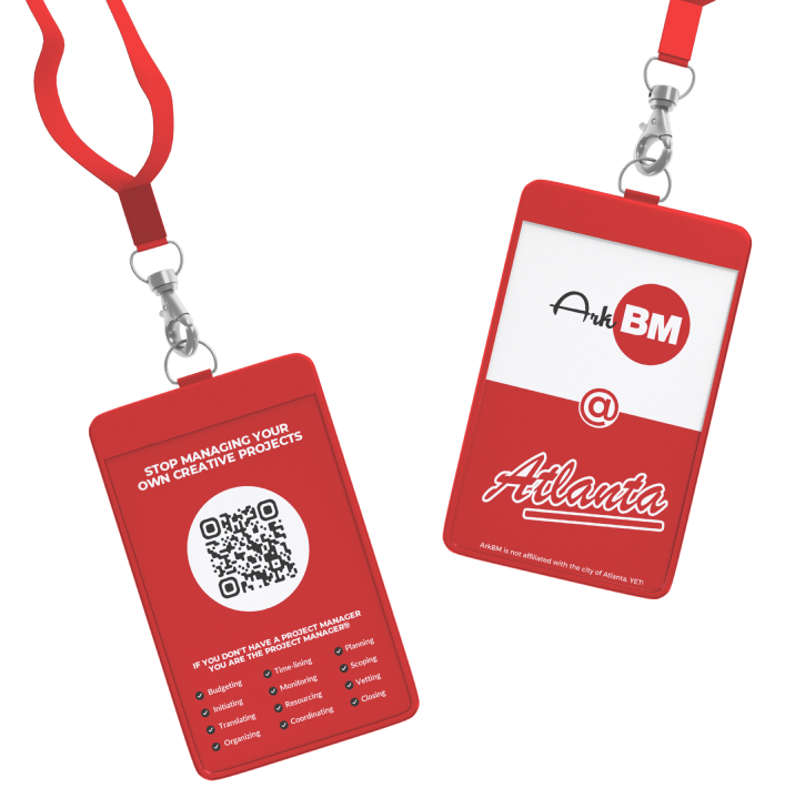
Partners
Collabs
All ArkBM partners docs will be shown side by side with our logo first.
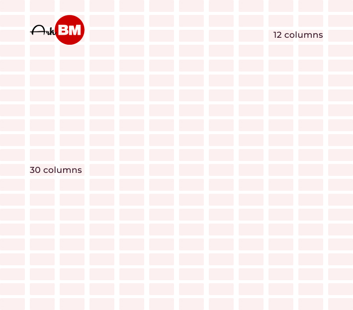
Grids
Using grids is essential to keeping consitency throughout every page
For the page set up, utilize 30 rows and 12 coloums to align text and components onto. If there are no side bars on the left or right use the center 10 columns and leave the last one on each side empty for extra padding.
Visual Hierarchy
Use the rule of thirds for page and component design. Place the most important information in the top 1/3rd of the screen in a horizontal layout then use the bottom 2/3rds vertically to place secondary information.
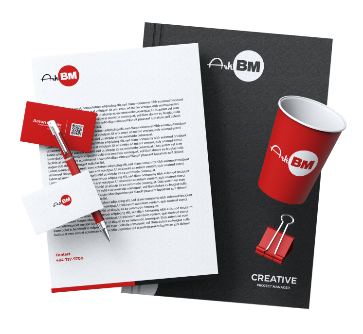
Stationary Pack
Business cards, stationary docs merch. and other mock ups available upon request.

Slogan
Learn our sound.
Brand personalities allow customers to relate to similar traits while building an emotional connect to the brand. We Sell, Manage & Retain.

Voice
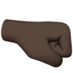
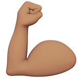
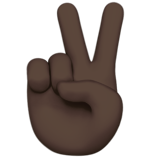
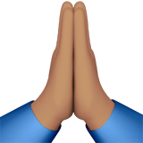
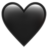
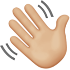
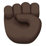
BLACK OWNED
People related emojis MUST display people of color
Sincerity & Competence
.svg)
.svg)
.svg)